PROTON HOLDING is a Malaysia national car manufacturer that was established 1983 and since then has developed various automobile for the Malaysian and overseas market.
PROBLEM STATEMENT
PROTON has positioned itself as an aspiring global automotive manufacturer. However, its website and mobile applications suffer from poor UI/UX design. This will in turn affect the brand trust.
PROJECT OBJECTIVE
The objective of this project is to redesign and optimize PROTON’s website and mobile applications to deliver a clear, intuitive, and performant user experience that aligns with its ambition to be a global automotive brand.
WHAT'S MY ROLE?
VISUAL DESIGNER
UI/UX DESIGNER
WEB DEVELOPER
CURRENT PROBLEM
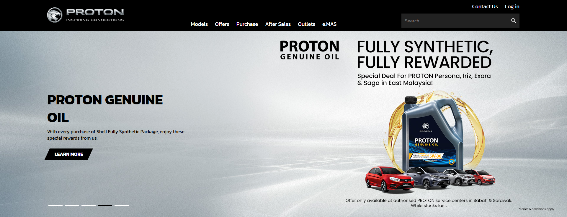
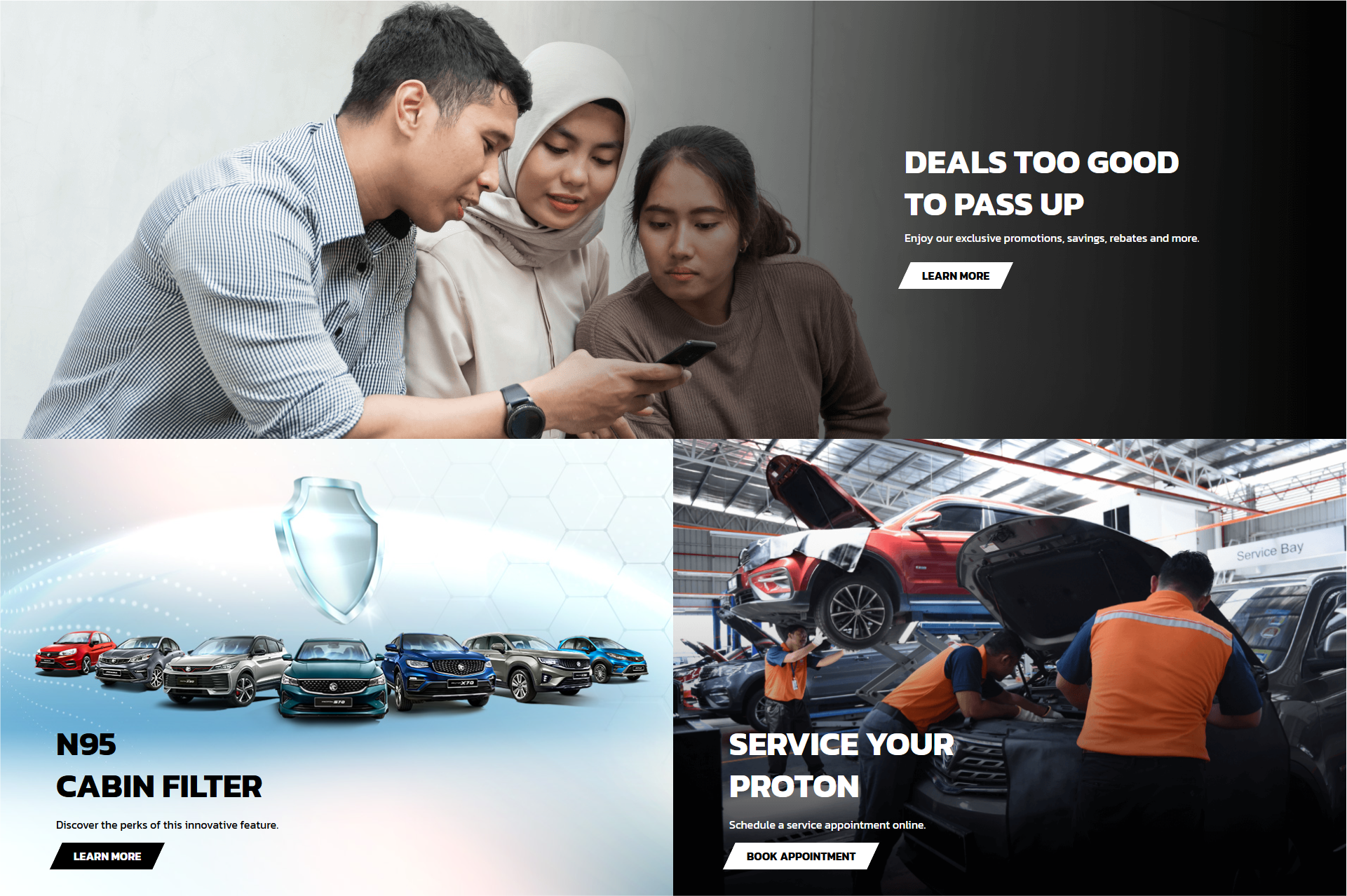
PROTON WEBSITE
The current website feels more like a brochure than a proper website. It overloads with information and not engaging.
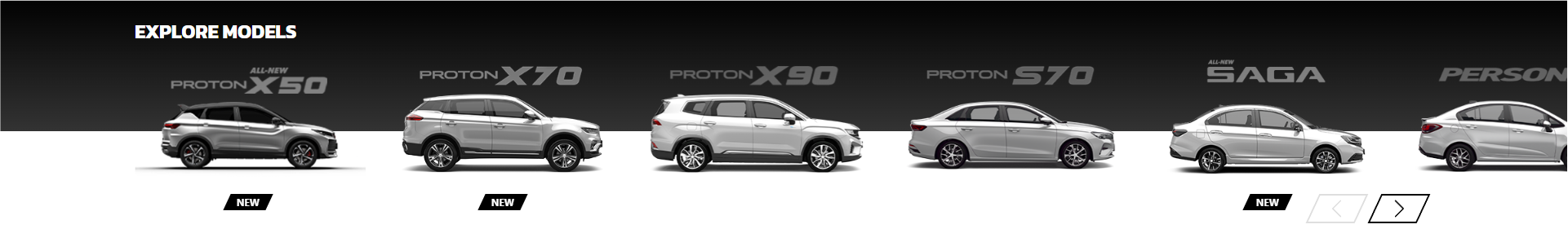
HOMEPAGE ISSUES
The main landing page opens with a moving information slider, followed by a car selection section. The slider feels ineffective due to excessive negative space and a lack of focus on the vehicles themselves.
Sliders that are not focusing on the cars. Too much information to process
Cars selection. Should be the main center of attention but they are small and often missed out
Basic hook. Could be improve with promoting what PROTON cars can offer
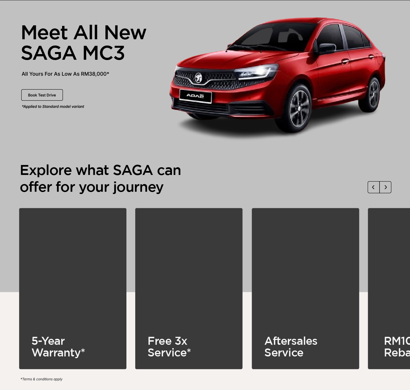
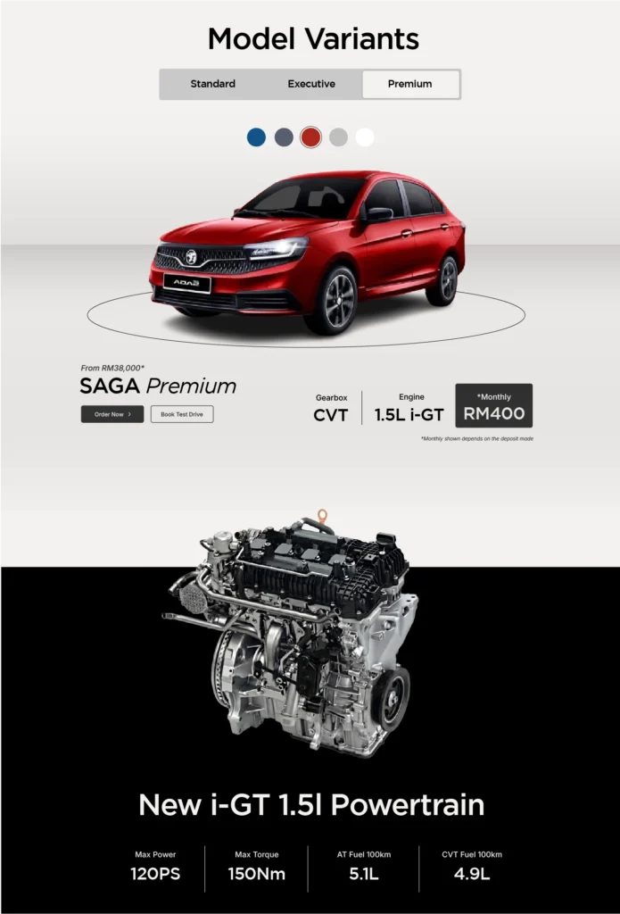
PRODUCT PAGE ISSUES
The car page is visually appealing but overly long and information-heavy, causing cognitive fatigue. Key decision-making elements lack prominence, reducing clarity and the hype of the user to make key decision.
Static hero is used and it does not feel engaging and immersive towards the user
Multiple rows with the same design and information that leads to cognitive overload
Cars comparison but hidden under tabs that creates unnecessary steps for the user to do
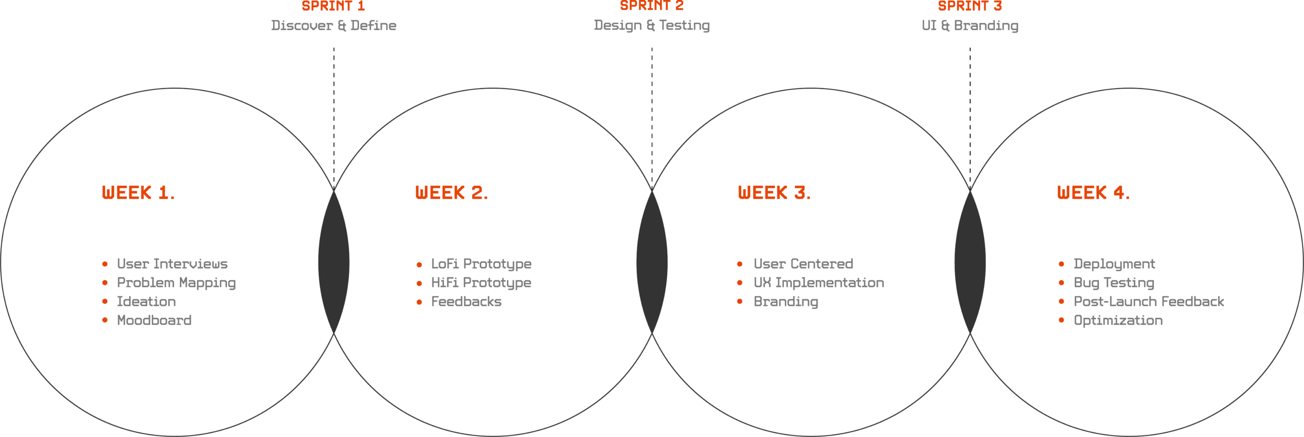
WIREFRAMING PROCESS
UI/UX DRAFT
To create a better product with good UX, I have followed the design process showcased below for website design
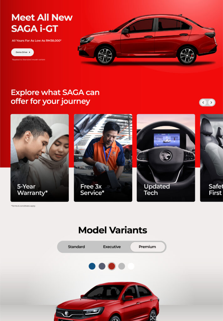
WIREFRAME UI/UX - HOMEPAGE
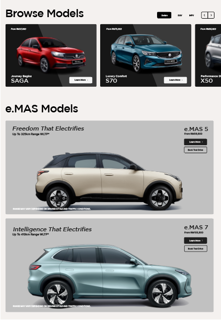
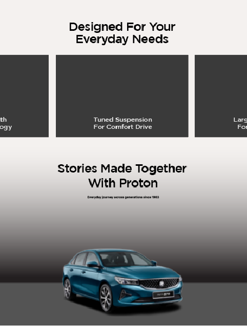
By using a “Show, don’t tell” approach, the website will focus on the cars themselves, using visuals as the main highlight. Each section will be arranged to tell a simple story, guiding users naturally through the page and engaged until the end.
Minimalistic header with video based hero to hook the user
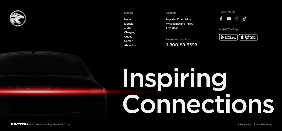
Footer with bold brand tagline to create a memorable end page
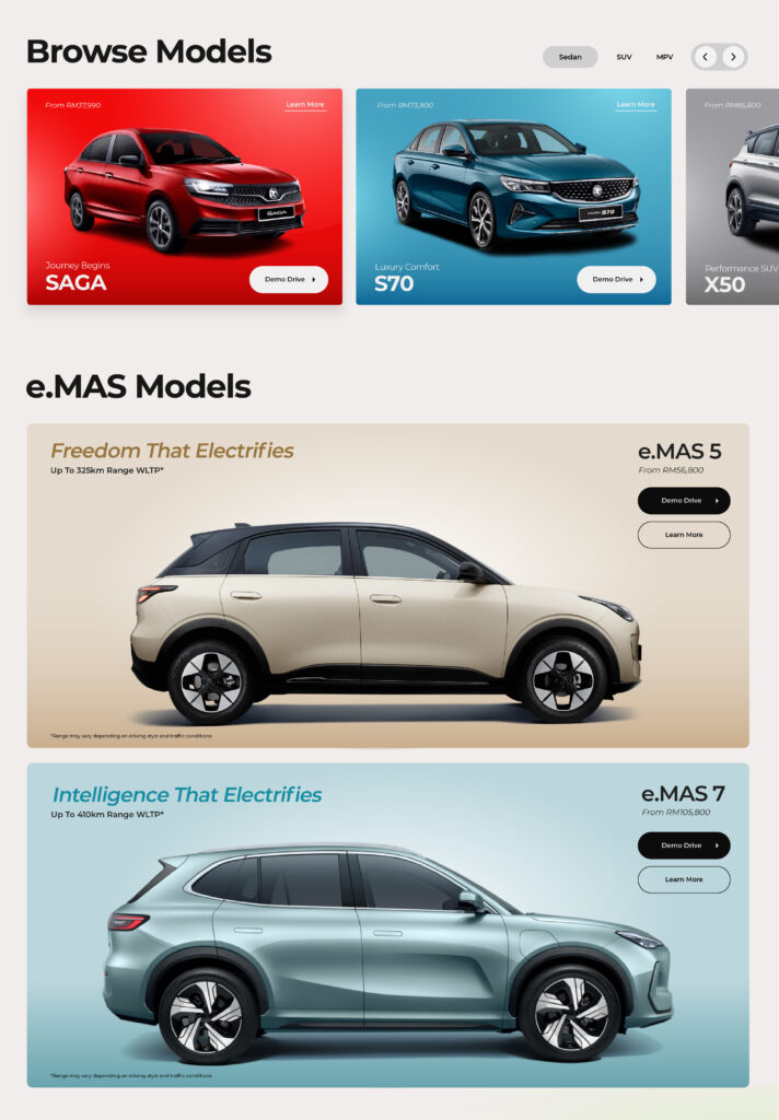
Rows for the revamped UIUX. Visuals as focal point and copywriting that make an impact on user emotions
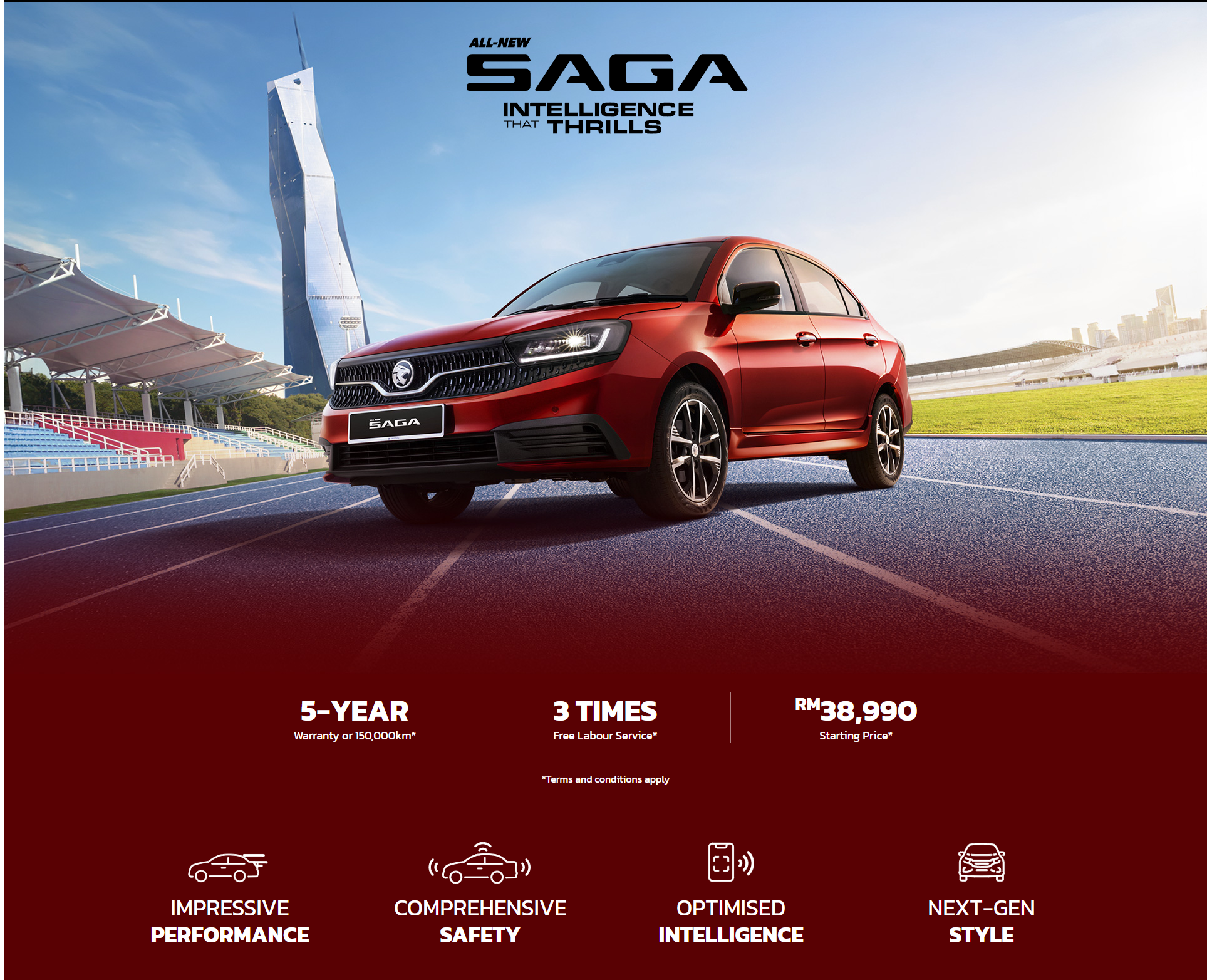
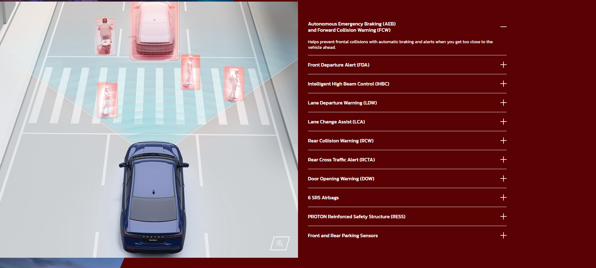
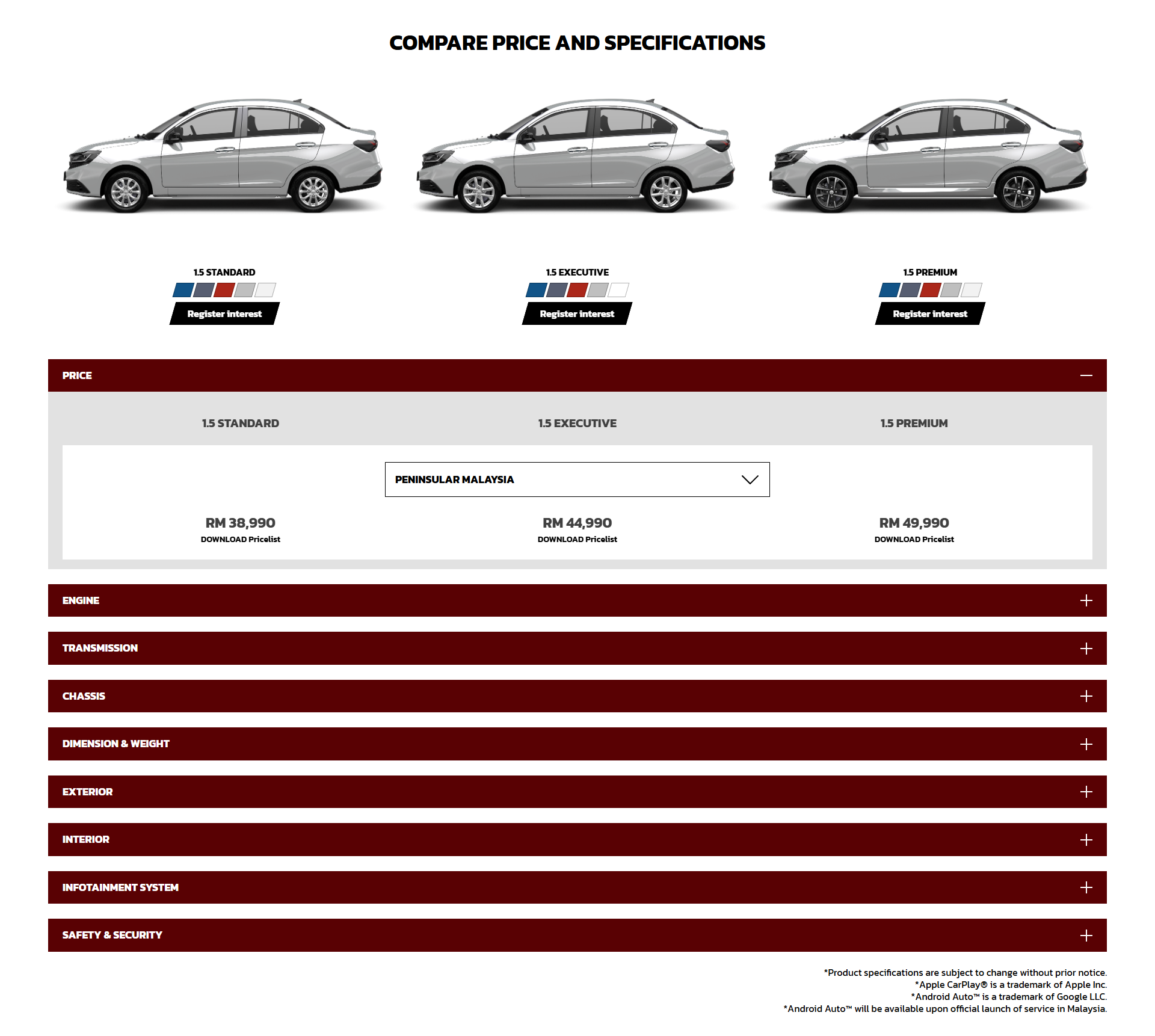
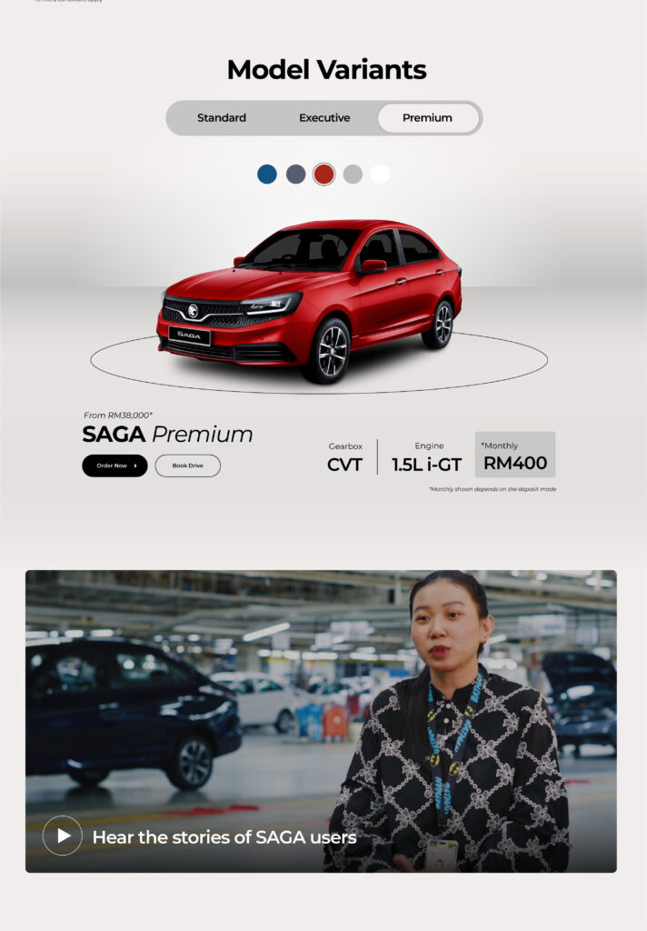
WIREFRAME UI/UX - PRODUCT
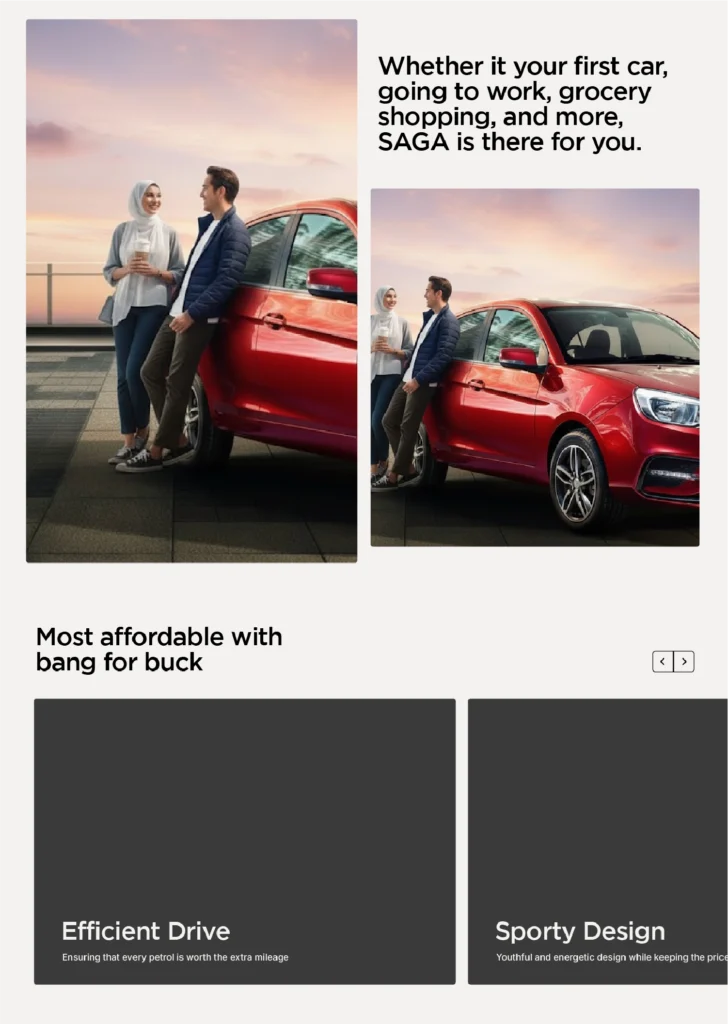
On the car page, visuals will be the main focus to keep users engaged. Each section will highlight the car and its unique selling points, supported by engaging copy that creates an emotional connection with users.
Section after the hero to emphasis on the product
Sections of the product page with each having their story to keep the user immersed
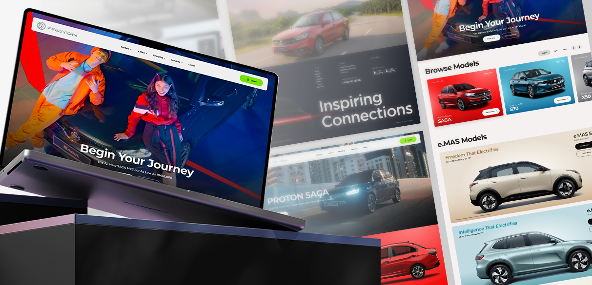
HI-FIDELITY CONCEPT
POST UI/UX
Based on the wireframing process, several amendments have been made to ensure an engaging digital experience
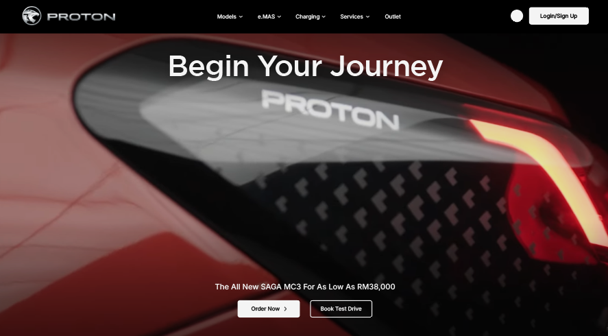
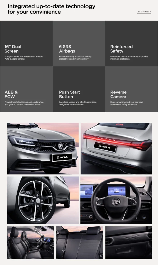
POST UI/UX - HOMEPAGE
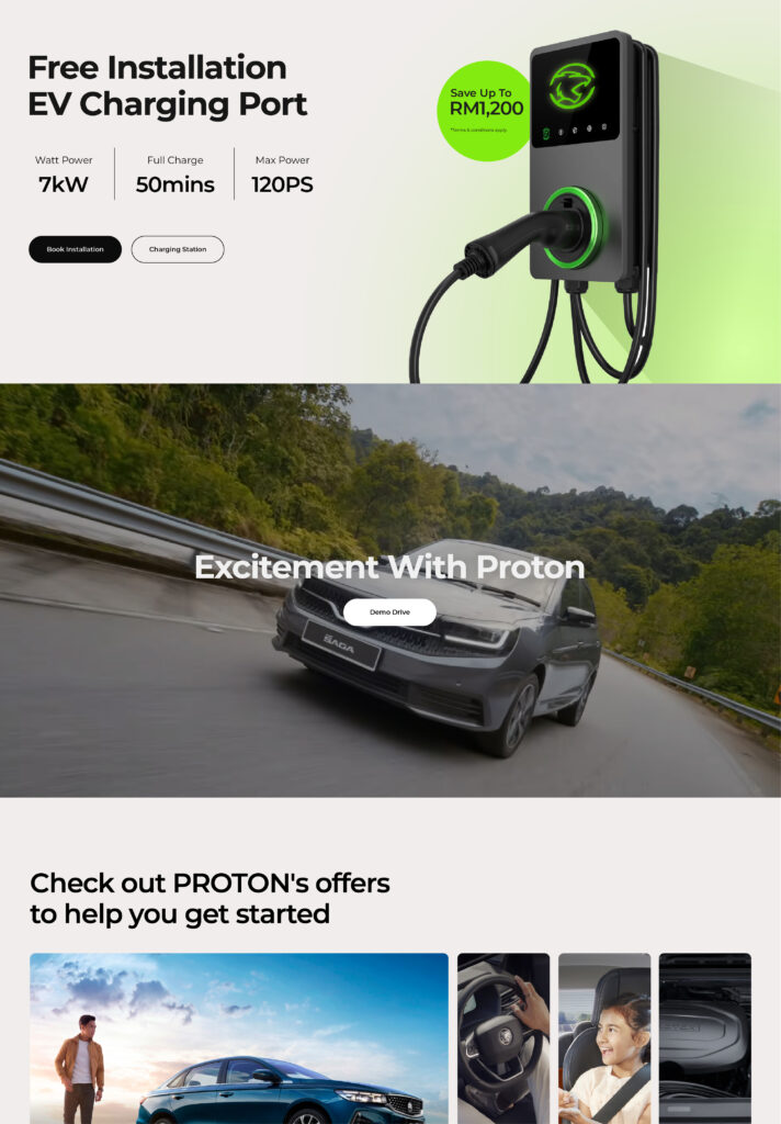
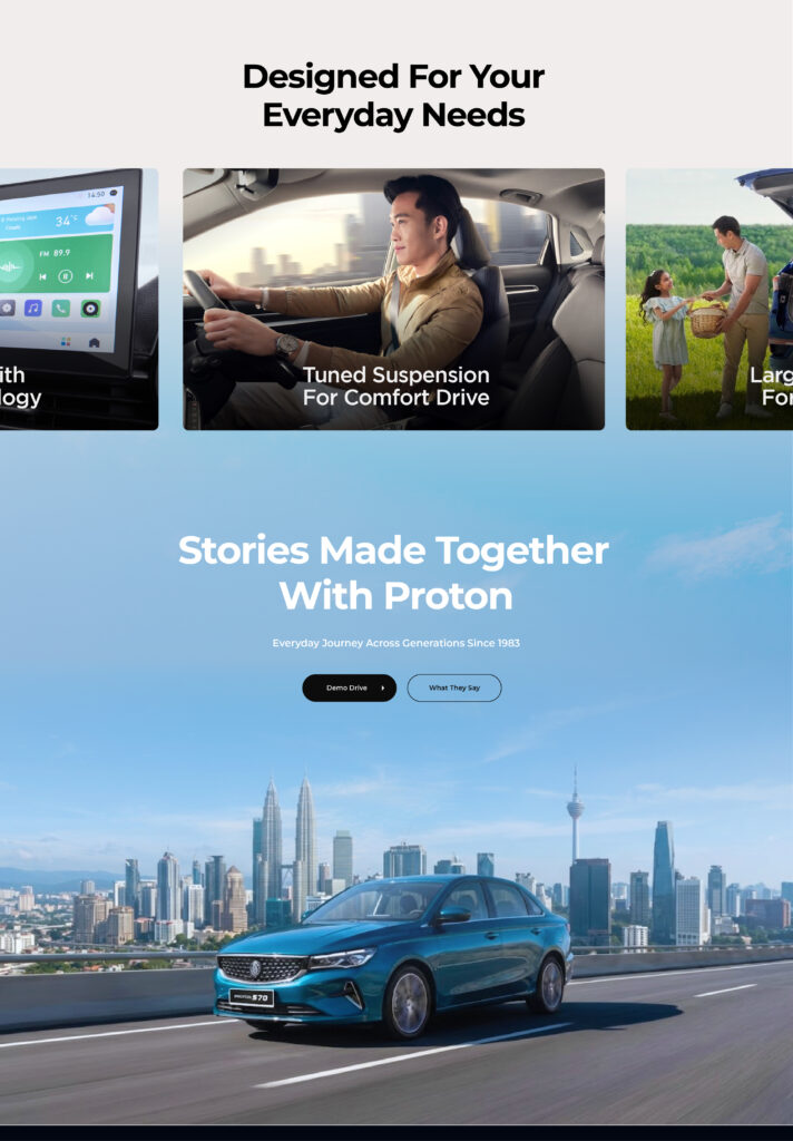
With the use of visuals and video to attract the user attention on each section of the homepage, this creates a high-impact first impressions that smoothly guide the user from start to end.
FULLPAGE SCROLL
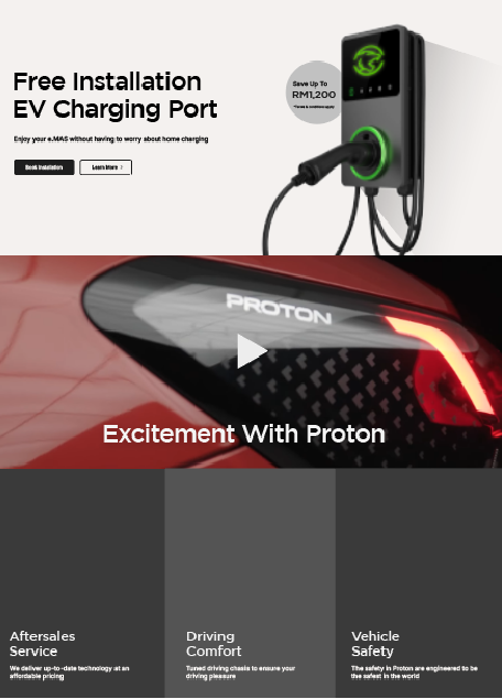
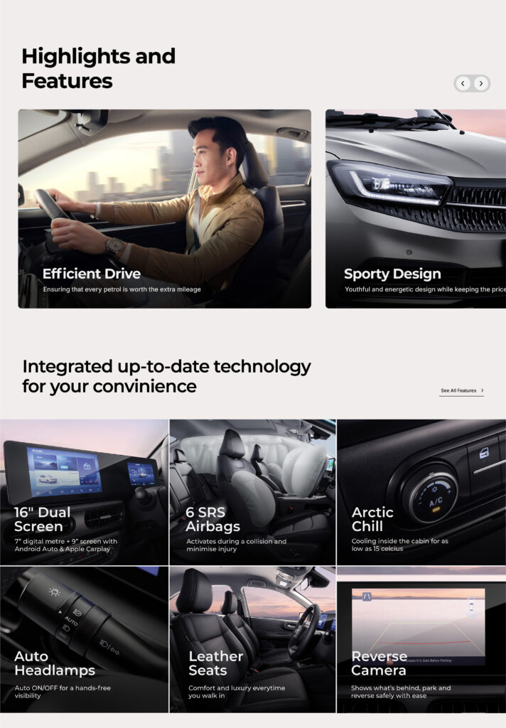
POST UI/IX - PRODUCT PAGE
The product page focused on the user journey and designed to move their interest into decision by emotion-based storytelling and unique selling proposition about the car.